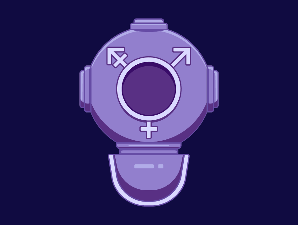
The Gendernauts
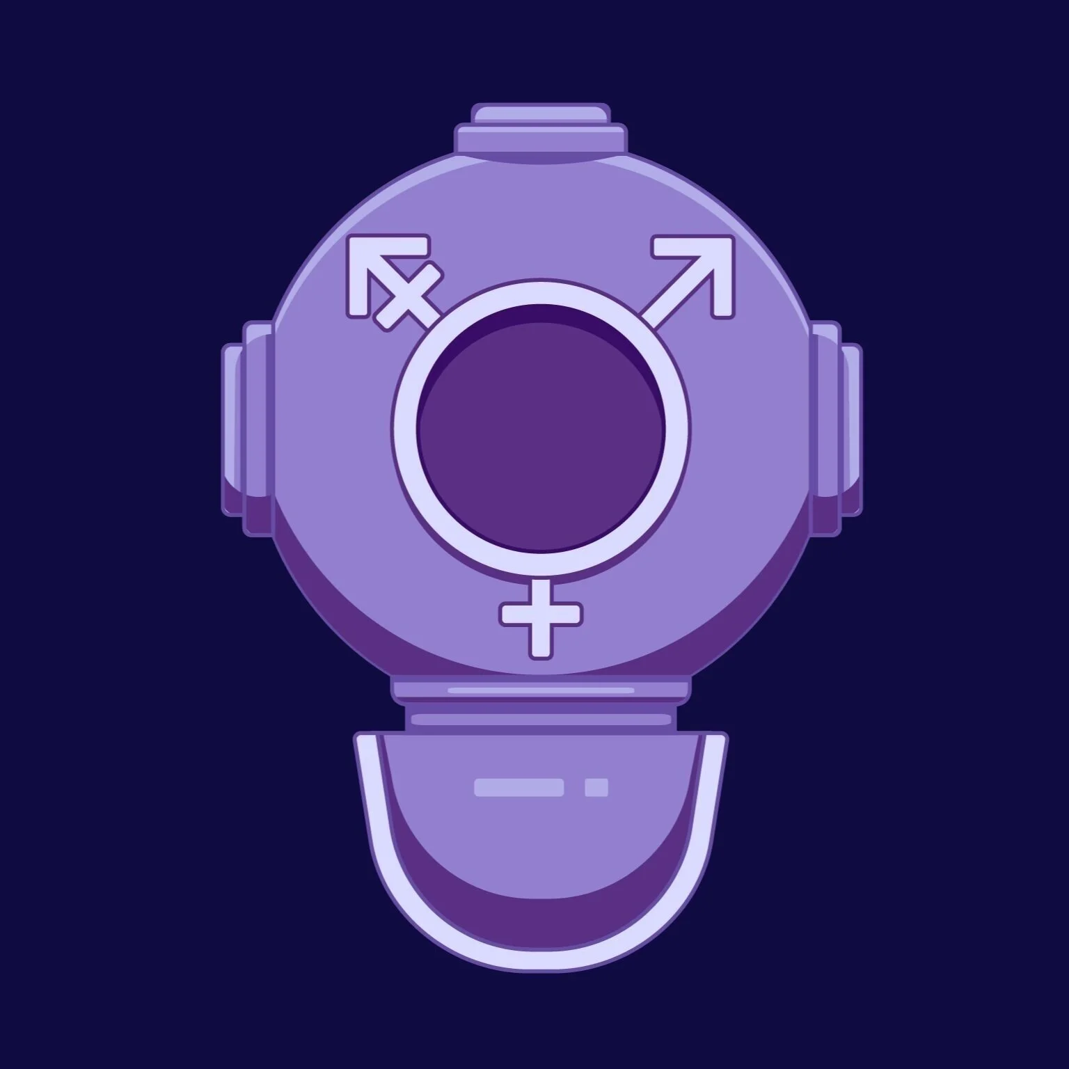
Logo | 2020
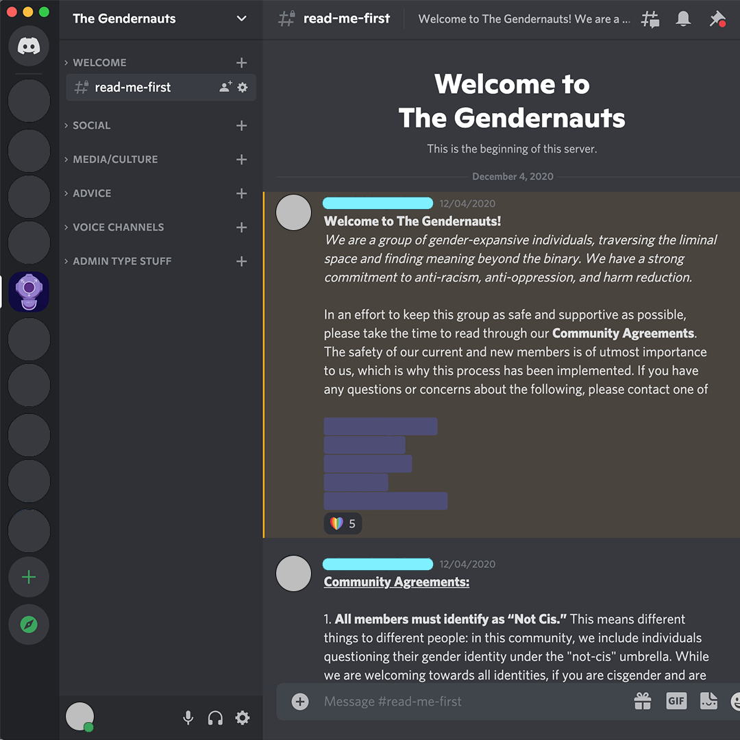
During the summer of 2020, a friend of mine approached me about starting a support and social group for gender non-conforming folks. The goal was to create a virtual space for members to meet other trans folks, explore what gender means to them, and to maybe find some reprieve from the state of the world.
As someone who was newly out and isolated due to the pandemic, I gladly joined The Gendernauts.
Inspiration and
Symbolism
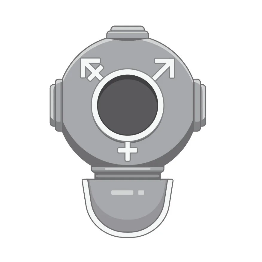
After we had a handful of members who we found on Lex, we created a Discord server and I realized I had an opportunity to create an image for this group. My inspiration came from our mission statement; “to explore gender in a liminal space”. I chose to base the logo off of old scuba gear since undersea exploration felt the most appropriate. Galaxy images were kept on my mood board after this decision for the sake of color.
Sketching Process
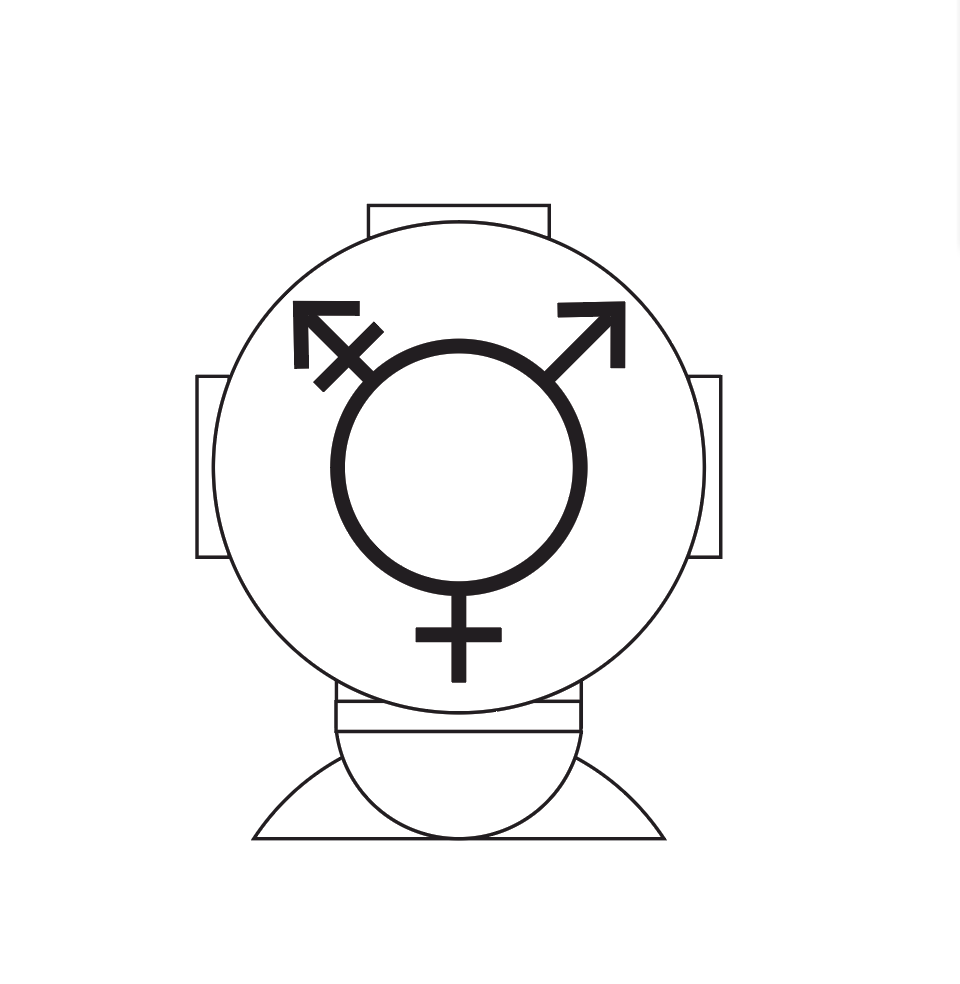
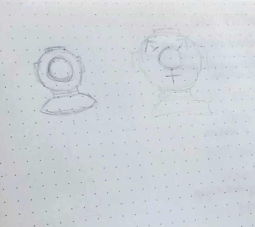
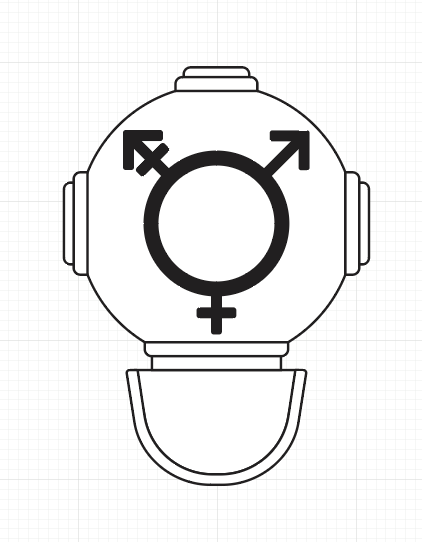
The sketch process was fairly simple as I had a strong concept going from the start. I started with a very simple build of the helmet, then went in to soften the shapes, correct proportions, and add details. In the last picture I added shadowing and highlights to create a 3D effect, and started to map out color placement using shades of gray.
Color
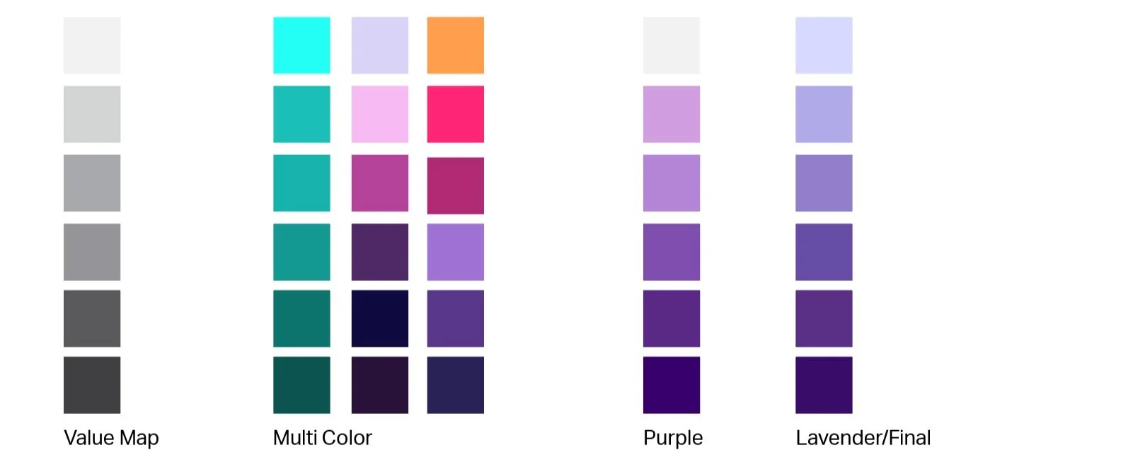
My first inclination was to use blue, but it felt too mechanical and a bit too obvious when paired with the old dive helmet. Multi-colored palettes quickly turned into various pride flags which made my decision to keep the design monochromatic. I went back to my inspiration board and decided to select colors from my galaxy images. The purple started to click for me, and I went further to make it a lavender pallet. Color holds a lot of weight in the queer community, and lavender is a hue that has unified us throughout history. I used it as my lightest value, and went from there to create the final pallet.
