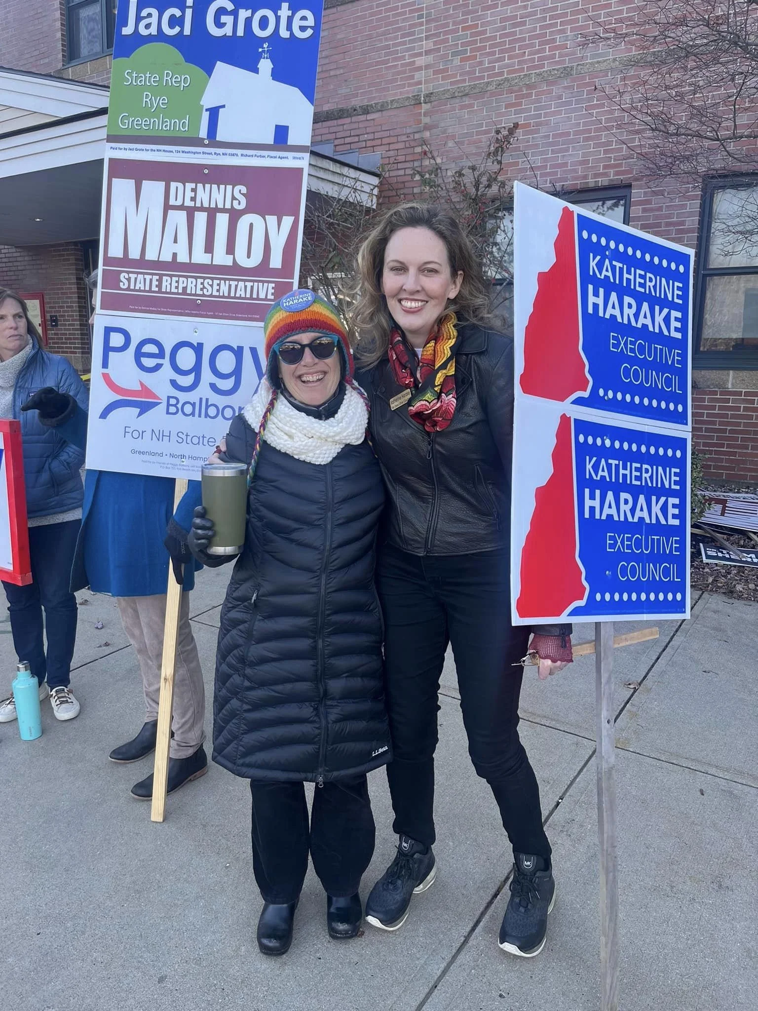
Katharine Harake
Logo | 2022
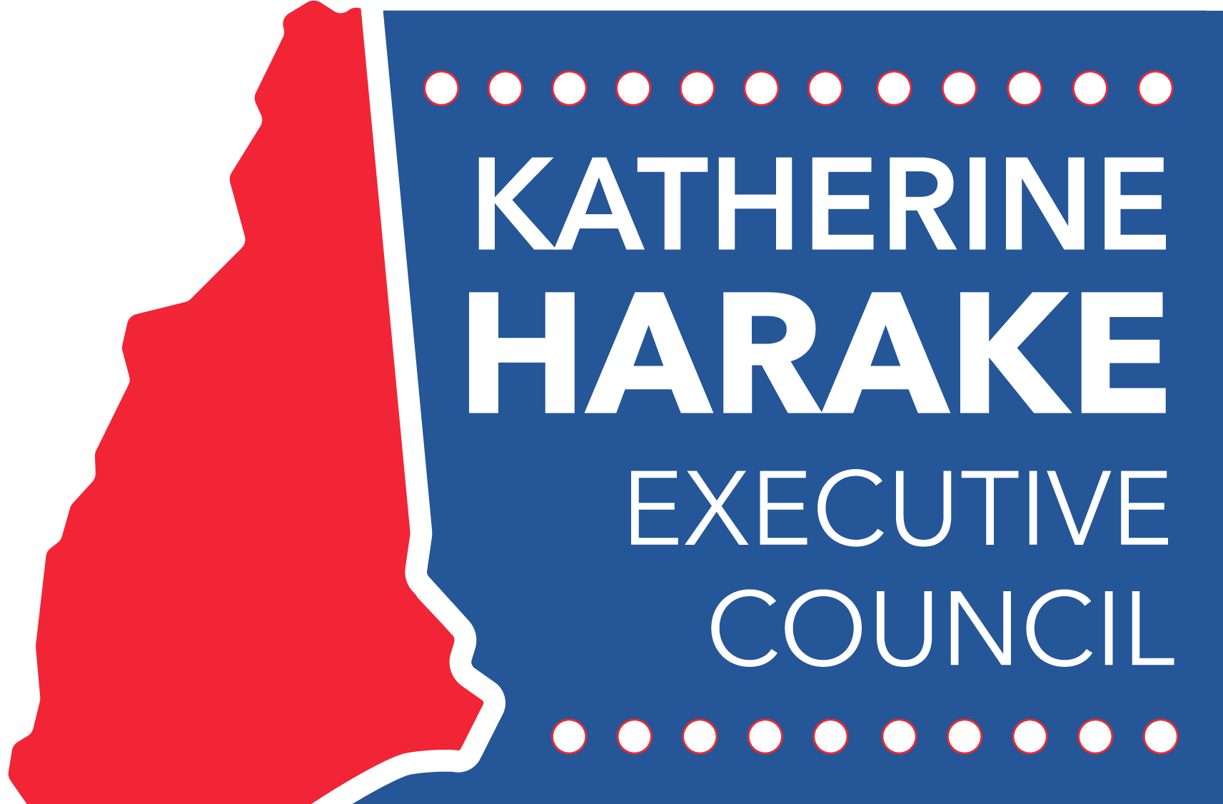
One of our responsibilities as designers at The Pivot Group was to create or redesign client logos. Katharine Harake, who was running for Executive Council in New Hampshire, came to us with her previous logo which was in need of an update. She requested that the hierarchy and color scheme remain the same, but wanted something lighter and more dynamic.
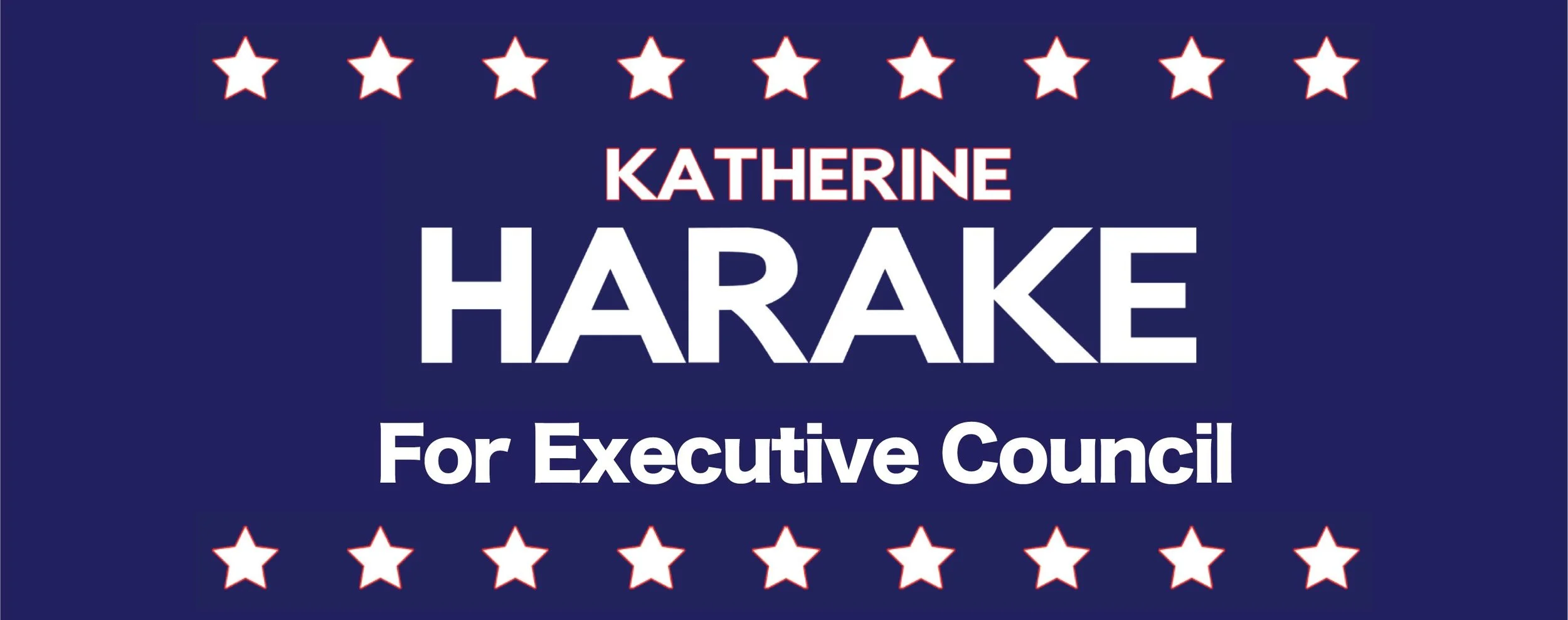
The image above was her current logo when we got the project. I started with what I didn’t want to change; the white text on the blue field, the general hierarchy, and I knew that Katharine liked the stars.
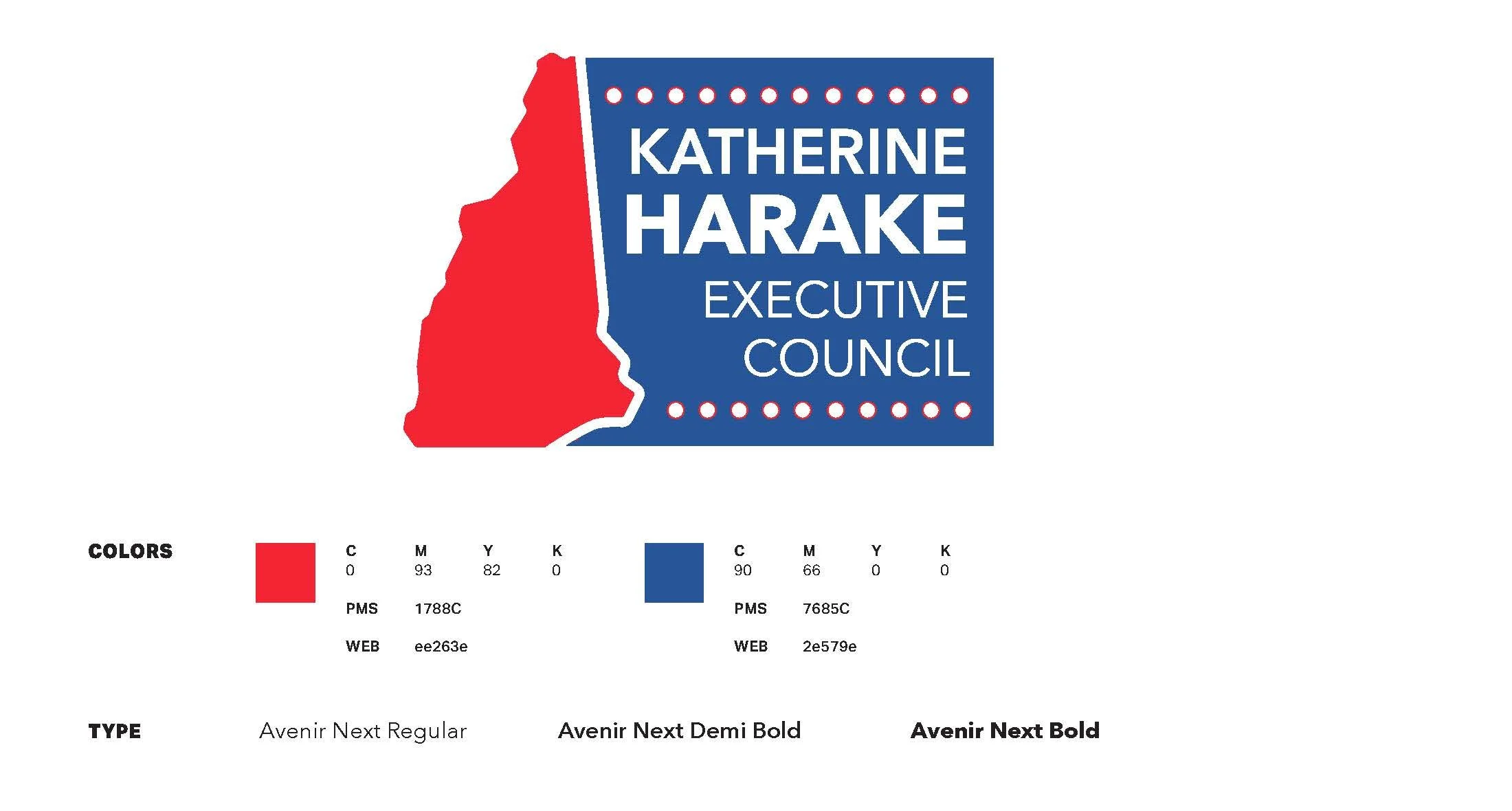
Katharine Harake also made it very clear that she’s proud of her upbringing in New Hampshire. That is what made my decision to have the state shape take up most of the composition. The rest of the details are mostly a facelift of what she already had. I balanced out the colors she had requested to stay, cleaned up the block of text, and replaced the stars with circles.
